
Front End React Patterns for Large, Shared Components


Large, shared components are where React codebases tend to “feel fine”… until they suddenly don’t. A small UI primitive is easy to reuse, but a shared DataGrid, FilterBar, Wizard, AppShell, or PermissionedActionMenu quietly accumulates product rules, edge cases, and performance costs. After a few quarters, teams stop changing it because it is too risky, and they start duplicating it because it is too slow to adapt.
This guide focuses on front end React patterns that keep large shared components flexible, testable, and safe to evolve, without turning them into a framework inside your app.
If you want the broader “how to structure a React app” view, start with Wolf-Tech’s guide on React front end architecture for product teams. Here, we zoom in on the component library layer where reuse either compounds your speed, or compounds your pain.
What makes a shared component “large” (and risky)
A shared component becomes “large” when it has most of these traits:
- It is used across multiple product areas or teams.
- It encodes business-specific behavior (not just visuals).
- It orchestrates async work (fetching, caching, optimistic updates, retries).
- It owns keyboard and focus behavior (menus, dialogs, grids).
- It has many extension points (custom cells, per-tenant rules, conditional actions).
The failure mode is usually the same: a single component becomes the place where every exception lands. The fix is not “split everything into smaller components” by default. The fix is to introduce intentional seams.
Pattern 1: Headless core + styled wrapper (separate behavior from appearance)
When a component is both reusable and complex, the most stable seam is often: logic and accessibility in a headless layer, visuals and layout in a wrapper.
- The headless layer exports state, event handlers, and ARIA attributes.
- The wrapper decides markup, styling system, spacing, and theming.
This is the same idea you see in libraries like React Aria (headless primitives) and is one reason teams adopt solutions like Radix UI or Ariakit for behavior-heavy widgets.
A minimal example (sketch):
type UseGridArgs<Row> = {
  rows: Row[]
  getRowId: (row: Row) => string
  onRowActivate?: (row: Row) => void
}

function useGrid<Row>({ rows, getRowId, onRowActivate }: UseGridArgs<Row>) {
  // selection, focus index, keyboard nav, aria props...
  return {
    getGridProps: () => ({ role: 'grid' as const }),
    getRowProps: (row: Row) => ({
      role: 'row' as const,
      key: getRowId(row),
      onDoubleClick: () => onRowActivate?.(row),
    }),
    rows,
  }
}

function Grid<Row>(props: UseGridArgs<Row> & { renderRow: (row: Row) => React.ReactNode }) {
  const api = useGrid(props)
  return (
    <div {...api.getGridProps()}>
      {api.rows.map(row => (
        <div {...api.getRowProps(row)}>{props.renderRow(row)}</div>
      ))}
    </div>
  )
}
Why this works:
- You can reuse the behavior (keyboard, focus, selection) across design variants.
- You can test behavior independently from visuals.
- Your design system can evolve without rewriting business logic.
Pattern 2: Compound components (but with explicit, limited surface area)
For “container + parts” components (Tabs, Menu, Modal, Wizard), compound components are a clean way to expose structure:
WizardWizard.StepWizard.Navigation
The pitfall is “context soup”: global context that leaks everywhere and becomes untestable.
Two rules keep this pattern healthy:
- Scope context to the instance (provider inside the component, not at app root).
- Expose only what consumers need (avoid dumping the entire internal state into context).
React’s docs on Context cover the basics, but the key for large shared components is governance: treat context values as API.
Pattern 3: Controlled + uncontrolled support (with a consistent contract)
Large shared components often need to work in two modes:
- Uncontrolled: internal state, minimal wiring (great for simple screens).
- Controlled: parent owns state (required for URL sync, cross-widget coordination, or analytics).
A stable pattern is:
value+onValueChangefor controlled usage.defaultValuefor uncontrolled.- Single source of truth inside the component determined at mount.
For complex widgets, consider a “state reducer” approach (popularized by Downshift), where you allow consumers to intercept transitions instead of exposing every internal hook.
This keeps the API smaller than “20 callbacks for 20 edge cases”.
Pattern 4: State machines for multi-step flows and async-heavy UI
If the component is effectively a workflow (checkout, onboarding, KYC, import wizard), model it as states and transitions.
You do not need a heavy framework to get value. Even a simple discriminated union for state plus explicit events is a big upgrade over boolean flags.
Example shape:
type WizardState =
  | { tag: 'editing'; step: number }
  | { tag: 'submitting' }
  | { tag: 'success' }
  | { tag: 'error'; message: string }

type WizardEvent =
  | { type: 'NEXT' }
  | { type: 'BACK' }
  | { type: 'SUBMIT' }
  | { type: 'RESOLVE' }
  | { type: 'REJECT'; message: string }
Benefits:
- Fewer invalid combinations (no more
isSubmitting && isSuccess). - Easier test coverage (test transitions, not DOM timing).
- Clearer UX alignment (states match user-visible modes).
If you adopt a library, XState is a common choice for complex flows, but the core win is the modeling discipline.
Pattern 5: Extension points via “slots” (avoid prop explosions)
A shared component tends to grow a long list of “just one more prop” customizations:
showToolbar,toolbarPosition,toolbarVariant,toolbarExtraActions,toolbarRight, …
Slots keep customization explicit and bounded.
Prefer:
slots={{ Toolbar, EmptyState, RowActions }}slotProps={{ toolbar: {...}, rowActions: {...} }}
Over:
- 25 unrelated props.
Slots also play well with headless cores: the core exposes a small “render API”, and consumers decide what to render.

Pattern 6: Adapter layer (map domain data to generic component contracts)
One of the biggest long-term mistakes is pushing domain rules into the shared component because “it is used everywhere”.
Instead, define a generic contract for the component, and write adapters per domain:
- The component understands
rows,columns,actions,permissionsin abstract. - The domain adapter translates “Invoices” or “Tickets” into that contract.
This is especially important for shared components that involve permissions and conditional actions. Keep authorization rules visible at the integration layer, not hidden inside a generic UI.
Wolf-Tech’s broader guidance on boundary discipline is covered in JS React patterns for enterprise UIs. For large shared components, adapters are often the seam that prevents a “global widget” from turning into a product-specific monster.
Pattern 7: Performance budgets and “fast by default” rendering
Large shared components are common performance culprits because they sit on hot paths: dashboards, search results, admin tables.
A practical approach is to define a performance budget for the component and enforce it with measurable checks (even if they start simple).
Common, high-leverage patterns:
- Virtualize long lists and tables (windowing).
- Keep row rendering pure and memoizable.
- Avoid derived state that re-computes heavy transforms on every render.
- Make expensive features opt-in (for example, column auto-sizing, rich cell renderers).
If you are building on Next.js, it is also worth being intentional about client boundaries and bundle size. Wolf-Tech’s Next.js best practices for scalable apps and React Next.js when to use server components help you decide what must be interactive.
A simple “shared component performance” review table
| Concern | Symptom in large shared components | Pattern that usually helps |
|---|---|---|
| Render cost | Typing or filtering lags | Virtualization, memoized row/cell renderers |
| Bundle size | Component inflates initial load | Headless core reuse, split optional features, code-splitting |
| Too many re-renders | Changing one prop re-renders everything | Stable props, context scoping, selector-based stores |
| Slow data interactions | Loading feels inconsistent across screens | Standardize server-state approach (TanStack Query, SWR, RTK Query) |
Pattern 8: Accessibility as API (keyboard and focus behavior are not “extras”)
Large shared components often implement the hardest accessibility problems: menus, dialogs, comboboxes, data grids.
Two practical rules:
- Treat ARIA roles and keyboard behavior as part of the public contract. If you change them, that is a breaking change.
- Prefer proven primitives for focus management and roving tabindex unless you have strong in-house expertise.
Useful references:
- React’s Accessibility guidance.
- The WAI-ARIA Authoring Practices Guide (APG) for interaction patterns.
The APG is especially valuable when your shared component is a “platform” element. The point is not to chase perfect compliance, it is to avoid shipping inconsistent, surprising keyboard behavior across the product.
Pattern 9: Component-level “contracts” for testing (beyond snapshot tests)
The goal of shared components is safe reuse. That means tests must prove behavior, not structure.
A reliable stack (and why):
- Storybook stories for documented scenarios (acts as living spec).
- Interaction tests for keyboard and critical flows.
- Playwright for end-to-end checks on top user journeys.
- Accessibility checks on stories or routes.
For React behavior tests, Testing Library encourages testing from the user’s perspective, which tends to match what breaks in real apps.
Where teams get stuck is trying to test “every prop combination”. Instead, define a small set of contract scenarios:
- “No data” empty state
- “Loading then success”
- “Error and retry”
- “Keyboard navigation”
- “Permission hides action”
Pattern 10: Versioning and deprecations (governance for shared components)
Shared components fail socially before they fail technically. If teams do not trust the component library to evolve safely, they will fork it.
Three governance defaults that work in practice:
- Semantic versioning for the shared component package, with a changelog that calls out breaking changes and migrations.
- Deprecation windows (time-based or release-count-based) for API removals.
- An explicit escape hatch policy: what kinds of customization are allowed (slots, adapters), and what kinds are rejected (patching internals, CSS reaching into private DOM).
This aligns with how Wolf-Tech recommends treating standards and guardrails in multi-team environments, described in software development strategy for diverse teams.
Choosing the right pattern: a quick decision guide
| If your component is… | Prefer patterns… | Avoid… |
|---|---|---|
| Behavior-heavy (menus, dialogs, combobox) | Headless + wrapper, proven primitives, compound components | DIY focus management hidden in random hooks |
| Workflow-heavy (wizards, imports) | State machines, explicit state modeling | Boolean flag soup and implicit transitions |
| Highly customizable UI | Slots + adapters, controlled/uncontrolled support | Prop explosion and deeply nested conditional rendering |
| Performance-critical (grids, feeds) | Virtualization, perf budgets, memoizable renderers | “Everything is a render prop” without measurement |
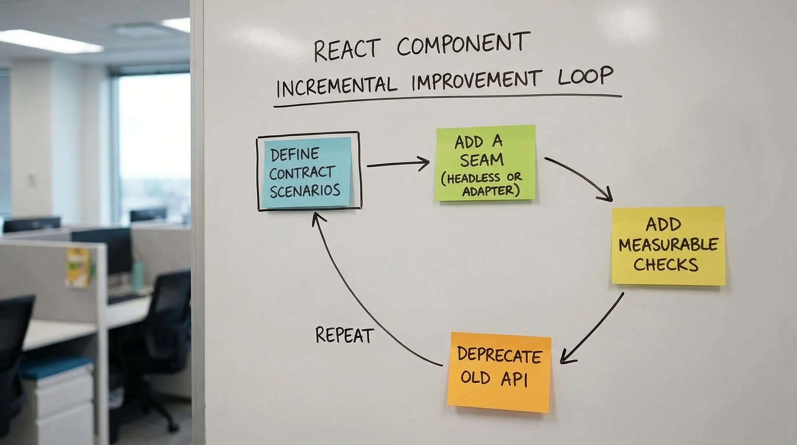
A pragmatic rollout plan (without a rewrite)
Most teams already have large shared components in production, and the goal is incremental improvement.
Start with one component that causes real pain (high change frequency, high bug rate, or performance issues), then apply these steps:
- Write down the component’s “contract scenarios” (the few behaviors you must protect).
- Introduce one seam (often headless core + wrapper, or an adapter layer).
- Add one measurable check (render time in a benchmark story, bundle size tracking, or a single keyboard interaction test).
- Deprecate one legacy API path and provide a migration snippet.
This matches the same philosophy Wolf-Tech applies in modernization work: incremental, evidence-driven change instead of big-bang rewrites. The broader modernization mindset is covered in refactoring legacy applications.
When to bring in help
If your shared components are blocking delivery, the issue is usually a mix of API design, architecture boundaries, and delivery discipline (testing, CI quality gates, performance budgets). Wolf-Tech can help by reviewing your component library and front end architecture, identifying the highest-leverage seams, and defining a practical migration plan that keeps shipping.
For related groundwork, see Wolf-Tech’s guidance on front end development deliverables that matter and the recommended tooling baseline in React tools for production UIs.