Web Application Designing: UX to Architecture Handshake


Most web apps fail to feel “simple” for one reason: UX gets designed as if the system were infinitely fast, perfectly consistent, and always available, while the architecture gets built as if users never change their minds, never hit back, and never work on a flaky mobile network.
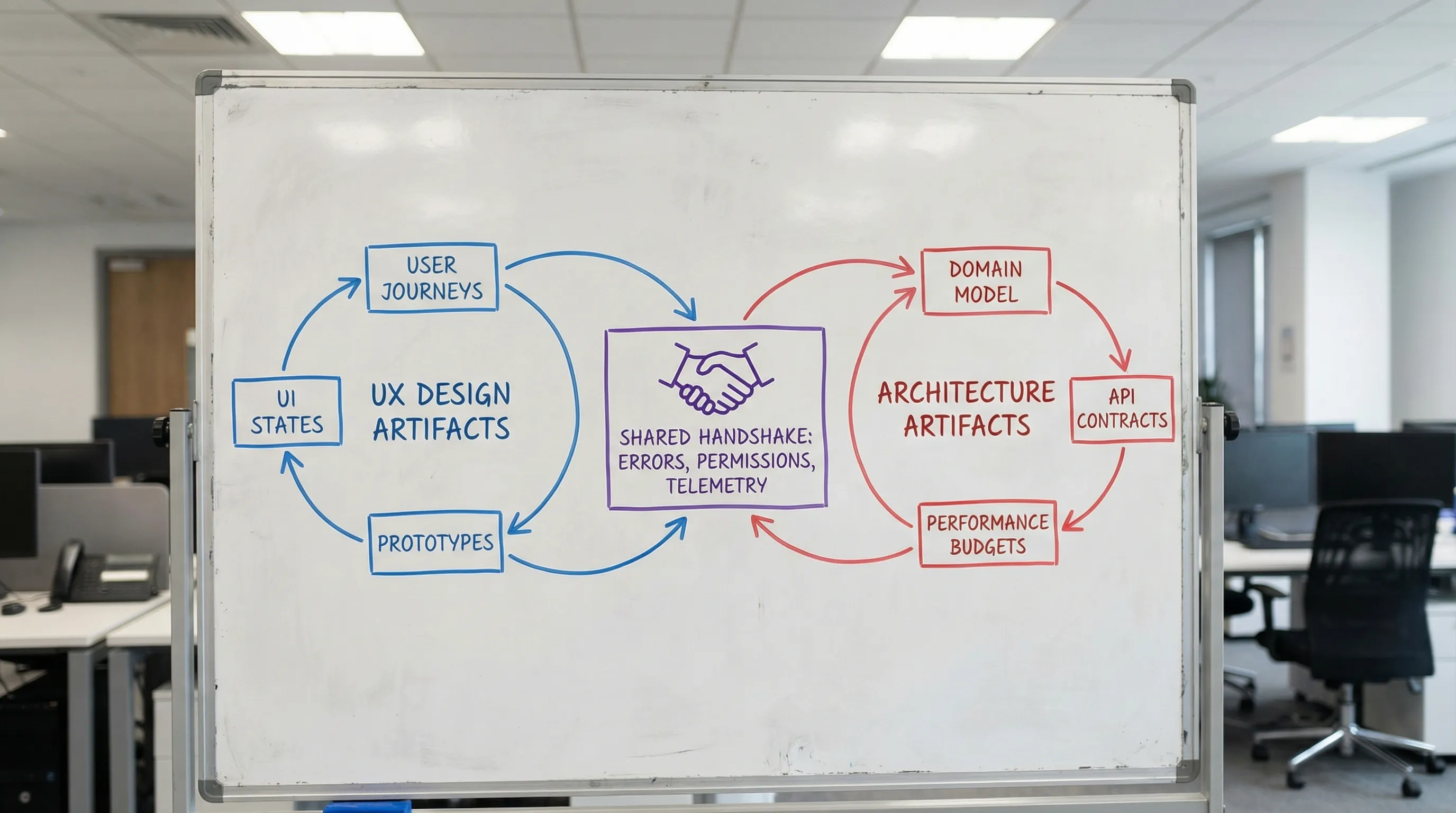
Web application designing works best when UX and architecture meet early, negotiate constraints, and agree on a shared set of deliverables. Think of it as a handshake: UX specifies the experience contract (flows, states, latency expectations, permissions, and error behavior) and architecture specifies the system contract (APIs, data lifecycles, consistency, caching, and operational guarantees). When those contracts align, teams ship faster with fewer rewrites.
What “UX to architecture handshake” means in practice
The handshake is not a meeting and not a single handoff. It is a repeatable alignment loop that answers two questions:
- What must the user experience guarantee? (speed, clarity, recoverability, accessibility, trust)
- What must the system guarantee to make that experience real? (data shape, latency, consistency, security, observability)
A useful way to frame it:
- UX owns intent: tasks, journeys, information hierarchy, interaction rules, edge states.
- Architecture owns feasibility: boundaries, data ownership, API contracts, performance and reliability budgets, deployment and change safety.
- Product owns trade-offs: where to spend complexity to create value.
If you want a broader foundation on web app components and runtime flow, Wolf-Tech’s guide on how a web application works is a helpful companion.
Why UX decisions change architecture (more than teams admit)
Certain UX choices look “purely UI” but force major backend, data, and platform decisions. Here are the usual culprits.
1) Latency expectations become your performance architecture
The moment a flow assumes “instant” feedback, your system needs a plan for:
- Round-trip count (one API call vs three)
- Caching and prefetching
- Optimistic UI and reconciliation
- Background work (queues, jobs, eventing)
In 2026, user-perceived performance is often evaluated through Core Web Vitals such as LCP, CLS, and INP. Google’s documentation on Core Web Vitals is a good baseline for aligning UX expectations with measurable budgets.
2) The UI’s information architecture becomes your data model pressure test
A dashboard that groups data by “Account > Workspace > Project > Environment” is not just navigation. It implies:
- Tenant and authorization boundaries
- Query patterns (filters, aggregates, time series)
- Indexing strategy and read models
- Pagination and sorting semantics
If the UI expects “global search across everything,” you may need dedicated search infrastructure or at least search-friendly data modeling.
3) Editing and collaboration patterns force consistency choices
A simple UX question like “Can two people edit this record at once?” leads to architectural choices:
- Last-write-wins vs version checks (ETags, row versions)
- Conflict resolution UX (diffs, merge UI)
- Audit trails and event logs
- Real-time updates (WebSockets, SSE) vs polling
4) Offline and resiliency UX implies state orchestration
If the UX supports offline mode, flaky networks, or “retry later,” the architecture must support:
- Local persistence and replay
- Idempotent APIs
- Clear error taxonomy
- Background sync
This crosses into reliability engineering, where patterns like idempotency, timeouts, and safe retries are essential. (Wolf-Tech also covers reliability practices from the backend side in backend development best practices for reliability.)
Why architecture decisions shape UX (whether designers see it or not)
Architecture is not just “implementation detail.” It defines what the UI can promise.
Constraints that should be visible in the UX
- Eventual consistency: If data can be temporarily stale, UX needs “updating” states and clear timestamps.
- Asynchronous processing: If actions enqueue jobs, UX needs progress and completion signals (and a place to find results later).
- Rate limits and quotas: UX needs graceful degradation and guidance.
- Security and compliance: UX needs explicit consent flows, audit visibility, and permission-aware UI.
Error handling and trust are product features
When architecture does not provide structured error semantics, UI ends up with generic “Something went wrong.” A good handshake defines:
- Known error categories (validation, auth, conflict, dependency down)
- User-safe messages and recovery actions
- Correlation IDs for support
That last item (supportability) is where operability and UX meet.
The handshake deliverables (what to align before “build” starts)
You do not need a 40-page spec, but you do need a shared set of artifacts that eliminate ambiguity. The most effective teams treat these as living documents.
| Handshake artifact | Owned by | What it prevents | What “good” looks like |
|---|---|---|---|
| Critical user journeys (top tasks) | Product + UX | Building the wrong thing first | 3 to 7 journeys with success metrics and edge states |
| State model per screen (loading, empty, error, partial) | UX + Eng | Surprise complexity late in dev | Explicit UI states tied to API behavior |
| Domain model + key entities | UX + Eng | UI that fights the data model | Shared vocabulary, primary entities, and relationships |
| API contract sketch (requests, responses, errors) | Eng | “We’ll figure it out” endpoints | Sample payloads, pagination, validation rules |
| Auth and permissions map (RBAC/ABAC) | Product + Eng | Permission bugs and security gaps | Permission-aware UX rules and server enforcement |
| Performance budgets (UI + API) | UX + Eng | Slow app with no plan | Targets for INP/LCP plus API p95 latency goals |
| Accessibility baseline | UX | Retroactive redesign | WCAG-aligned interaction and semantics |
| Telemetry plan (key events, errors) | Eng + Product | No learning post-launch | Events tied to outcomes, plus actionable error reporting |
For accessibility standards, the WCAG guidelines are the most referenced baseline. The key is not “perfect compliance on day one,” it is designing components and flows so accessibility is not a rewrite.
A practical workflow to execute the handshake (without slowing delivery)
This workflow fits both new builds and modernization work.
Step 1: Start with a thin vertical slice, not a complete UI
Pick one end-to-end journey that is high value and high uncertainty (for example: “Invite user, assign role, user completes onboarding, first successful action”). Then design and architect it as a production-grade slice:
- Real auth and permissions
- Real data creation and retrieval
- Real observability
- Real deployment path
This approach aligns with Wolf-Tech’s broader delivery advice around thin slices and MVP discipline, covered in Build a Web Application: Step-by-Step Checklist.
Step 2: Define UI state transitions as an API design input
Instead of starting APIs from “resources,” start from UI states:
- What does the screen need to render first paint?
- What can be lazy-loaded?
- What errors must be distinguished (conflict vs validation vs permission)?
If you do GraphQL, this is where query shape must match component boundaries. If you do REST, this is where endpoint design should minimize round trips.
Step 3: Treat “empty and error states” as first-class architecture requirements
Common examples that drive architectural choices:
- “No data yet” needs seeded defaults or guided creation
- “Partial data loaded” needs independent calls or streaming
- “Action accepted, processing” needs job status and notifications
A well-designed experience often depends on job orchestration, eventing, and idempotent operations, not just CRUD.
Step 4: Align rendering strategy to UX goals and data shape
Rendering is not only a frontend decision, it changes caching, auth, and TTFB.
| UX goal | Often points toward | Architecture implications |
|---|---|---|
| Fast content discovery, SEO pages | SSR/SSG/ISR | Cache strategy, edge/CDN, server data fetching |
| App-like navigation, heavy interactivity | SPA or hybrid | Client state discipline, API efficiency, auth flows |
| Personalized dashboards | Hybrid SSR + client fetch | Permission-aware caching, data aggregation strategy |
| Offline-first | PWA patterns | Sync engine, conflict handling, local persistence |
If you are using Next.js, Wolf-Tech’s Next.js best practices for scalable apps and performance tuning guide go deeper into the measurable side of these trade-offs.
Step 5: Create a shared “interaction budget” per journey
An interaction budget is a compact agreement that usually includes:
- Maximum API calls per key screen
- Target API p95 latency for the critical call
- Payload size expectations (especially for mobile)
- Caching rules (what can be stale, for how long)
This keeps web application designing grounded in engineering reality without lowering UX standards.
Step 6: Ship the slice with telemetry that proves the UX is real
Instrumentation is part of the handshake because it validates the contract.
Examples of handshake-ready telemetry:
- Funnel events (entered onboarding, completed onboarding)
- UX reliability indicators (error rate on save, conflict rate)
- Performance indicators (route-level INP/LCP from RUM)
- Support signals (correlation IDs surfaced on error screens)
Three common handshake scenarios (and the architectural patterns they trigger)
Scenario A: “One screen needs data from five systems”
UX wants a single, coherent view. Architecture options include:
- Backend-for-Frontend (BFF) aggregator endpoint
- GraphQL aggregation layer
- Precomputed read model (CQRS-style) for fast dashboards
The handshake question is: Does the user need real-time truth, or a fast, mostly-correct view with clear freshness indicators? That decision changes everything.
Scenario B: “Save should feel instant”
If UX requires instant feedback even when backend work is heavy:
- Use optimistic UI for low-risk updates
- Split “accept request” from “complete processing”
- Provide a reliable status view (and notifications)
This is where idempotency and job orchestration stop being backend niceties and become UX enablers.
Scenario C: “Permissions are complex and changing”
If roles and policies evolve, do not hardcode permission logic only in UI. The handshake should enforce:
- Server-side authorization for every action
- Permission-aware UI rendering (to reduce confusion)
- A shared permission vocabulary (actions, resources, scopes)
Handshake failure modes (and how to prevent them)
Failure mode 1: “Design is done” before constraints are known
Prevention: run a short feasibility loop early.
- Prototype the hardest state (not the happiest path)
- Spike the data shape and response times
- Validate accessibility and keyboard flows on real components
Failure mode 2: API contracts evolve without updating UX states
Prevention: define error and pagination contracts explicitly.
A small but high-leverage practice is to standardize:
- Validation error structure
- Auth and permission error semantics
- Conflict errors (including how to resolve)
Failure mode 3: Performance work becomes “later”
Prevention: set budgets and gate regressions.
If you already measure delivery performance with DORA metrics, apply the same discipline to user experience: make performance regressions visible in CI and release reviews.
Failure mode 4: Inconsistent vocabulary across UX and engineering
Prevention: keep a shared glossary.
“Account,” “workspace,” “organization,” and “tenant” cannot be synonyms in a multi-tenant app. Vocabulary drift creates UI confusion and data model complexity.
A quick handshake review scorecard (use this in design and architecture reviews)
Use this as a lightweight gate before a team commits to a build milestone.
| Area | Evidence to ask for | Red flag |
|---|---|---|
| Critical journeys | 3 to 7 journeys with success criteria | Only a feature list |
| UI states | Loading/empty/error/conflict defined | “We’ll handle errors later” |
| Data shape | Sample payloads per screen | Endpoints defined without consumers |
| Latency and budget | Per-journey interaction budget | No measurable targets |
| Permissions | Action-by-role map | Authorization only in frontend |
| Operability | Logs/metrics/traces plan, correlation IDs | No way to debug production issues |
| Accessibility | WCAG-informed component rules | Accessibility as QA only |
If you want a more general, architecture-focused review structure, Wolf-Tech’s article on what a tech expert reviews in your architecture complements this UX-oriented scorecard.
Where Wolf-Tech fits
Wolf-Tech works with teams that need web applications designed and built as coherent systems, not stitched-together layers. If your team is seeing redesigns, API churn, or performance surprises, the fastest fix is usually not “more meetings,” it is a tighter UX to architecture handshake with the right artifacts and review gates.
If you want a pragmatic second opinion on your current approach, Wolf-Tech can help with full-stack delivery, architecture reviews, and legacy modernization. Start by exploring their end-to-end perspective in the custom software application development guide or their practical delivery system thinking in the CI/CD technology guide.